CLIENT:
Simcha Island
Industry:
Entertainment
Launching an adventure park. Creating a unique identity
About Simcha Island
Simcha Island is a multi-dimensional property spread across 30 acres catering to a vast spectrum. The river flowing through the property makes it an island and its unique feature. An adventure park, resort, diverse dining options, a huge range of party lawns and banquets provide a great backdrop for weekend outings, group fun, weddings, stay or even corporate requirements. Simcha Island has a little magic for many walks of life.
The Brief
To establish the brand identity, identify USPs, further create visual identities for all functional visitor facing sub areas. The client wanted that identity should convey the end benefit to target audience.
The Logo
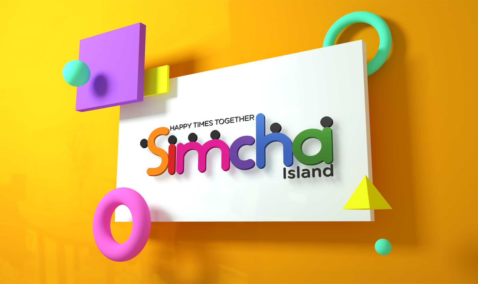
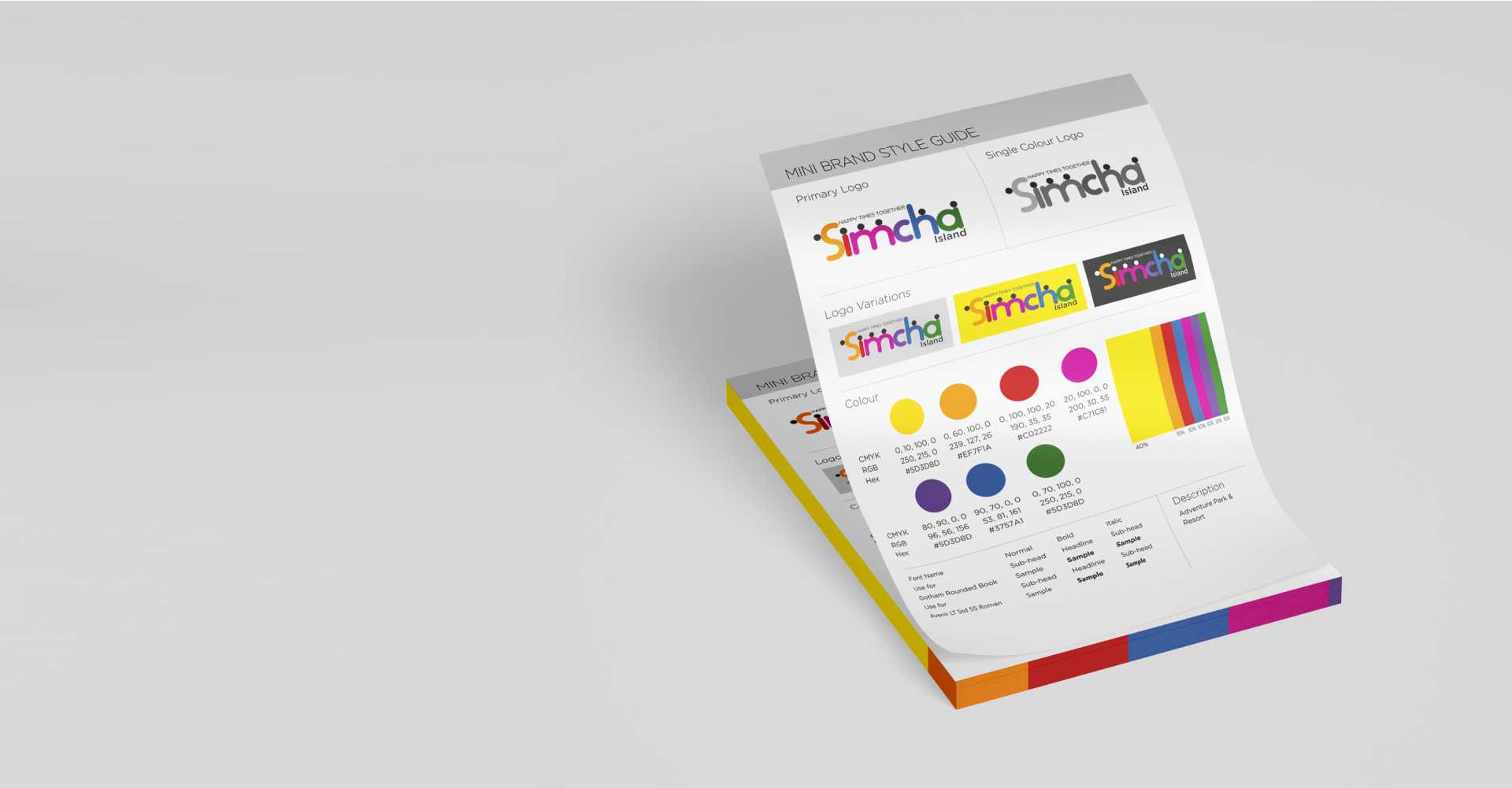
The challenge was to create a property identity as well as many sub-identities in a manner that all the divisions have their own identity and reflect the essence of Simcha Island. Thus formed a vibrant colourful logo, depicting fun time with loved ones portraying the tagline of Simcha – ‘Happy Times Together’. The black dot-heads represent people, coming together at Simcha for fun times with their tribe. The sub-identities are inclusive of Torq, Jump HQ, Saga, Stories, Symphony, Yumcha etc.

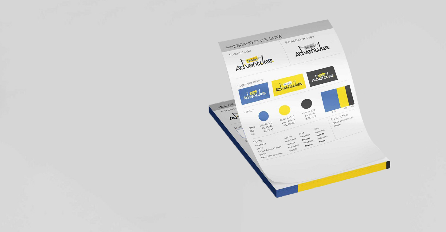
Simcha Adventure
Simcha Adventure houses all the activities. The offering most sought after by visitors. We chose a sans-serif typeface, tones of blue, yellow and black, depicting energy, immense fun and freedom, which resonates with the feel of the space. Continuing the essence of Happy Times Together, the ‘dot-heads’ in the logo are all having fun which drives back the attention to the main logo of Simcha Island.
Bamboo Brook
Bamboo Brook is a serene open space near the brook flowing through the property. It houses bamboo canopies, machan, polyhause and greenhouse. It's a space to experience the tranquillity of nature and dive deep into it. The logo elements and their muted colour palette is, in fact, picked from the property elements.
Saga
Saga - a long story, comprising tonnes of emotions. This is what saga is for - a place to celebrate all your important milestones. Saga offers lawns for weddings and other such gatherings. To depict all these joyous emotions, we choose the colour red for the logo. The red in Saga is for new beginnings, and the elegant serif typeface adds to the magnificent feel of the vibrant Indian weddings.

Stories
Stories nest rooms and banquets halls. A space designed for comfortable stays, coronate and personal events. The logo is blue and copper, and holds an elegant Moroccan-style floral design in the place of 'O'. The typeface is thin and compliments the overall design. The rich colours reflect the vibe of the space.

Symphony is a destination for weddings, receptions or family gathering. It stands beautiful beside the rivulet offering lawns and river-facing cottages. The logo of Symphony is pink with golden details in a handwritten font, Both the elements add a chic and young vibe to the logo that resonates with the space.
Yumcha
Yumcha is a flea market style food corner housed in a triangle space In the middle of Simcha Island. The name Yumcha is a melange of yummy and chaat. All the elements of Yumcha logo is hand-drawn from the text to the fork. It has a very warm feel to it that resonates with the freshly made food while spoon and fork depicts the 'eatery.' The colourful trinkets add to the flea market vibes while the colours divert back to the main Simcha Island logo.

