CLIENT:
Earthbox
Industry:
Food & Beverages
Creating and establishing the brand identity
About Earthbox
EarthBox is an organic food aggregator, procuring natural produce and organic food across India. Having both online and offline presence, Earthbox is one of a kind organic and natural food store in Indore. With the core philosophy of ‘Food from origin,’ Earthbox is focused on promoting clean, pure and natural foods by collaborating with the brands across India that prepare unadulterated delicious eatables procured from the lap of nature. The name EarthBox itself suggests the vision of offering the best of Earth’s products, while re-connecting with our age-old roots and choosing sustainability.
The Brief
We met EarthBox when it was in the initial stage. This client wanted us to deeply invest ourselves in the project and create a 360 degree branding solution. The name further establishes similar online and offline identity despite the mediums being extremely different.
Our Approach
We started with understanding the need of creating an online & offline identity. The identity creation started with the logo of EarthBox and tagline. The name EarthBox depicts the earthy platter full of natural & organic produce, while the tagline – ‘food for origin’ is a clear-cut message about the quality of produce.
What we delivered
The EarthBox logo is type-based, adaptive and responsive. The bold font grabs the attention while the colours depict the natural elements of Earth. The box – jagged and uneven from the edge – represents how nature is perfect and never the same. The logo as a whole communicates receiving a box of all organic products, delivered to the buyer.
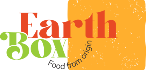
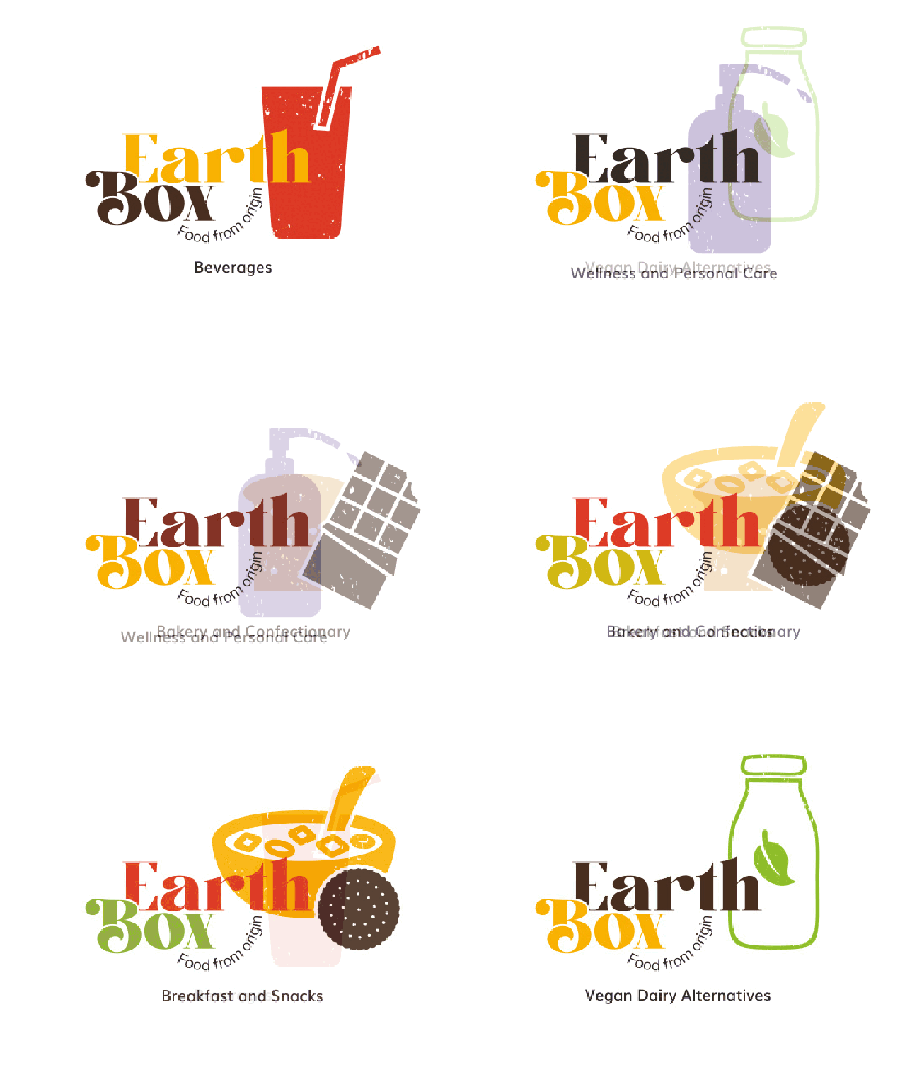
The logo is very adaptable because of the various categories offered. This adeptness keeps it fresh and unique.
Colour palette
The colour palette is inspired from the elements of nature. From the green of nature to the yellow of harvest, EarthBox’s colours tell a tale of adaptive colours, commonly found everywhere around us, taking us back to ‘dreamy good old days’. An extensive colour palette was created to showcase the wide range of categories available at EarthBox.
Primary Colours

Fire Yellow
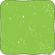
Leafy Green
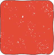
Apple Red
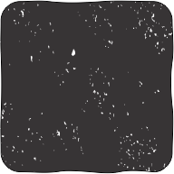
Midnight Sky
Secondary Colours

Cloud Grey
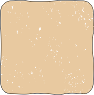
Latte

Daisy White
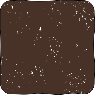
Chocolate Brown

Cerulean
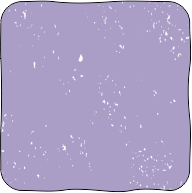
Heather Purple
Typography
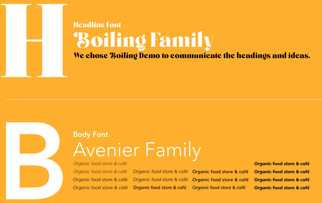
Earthbox is all about making a statement while being humble. A combination of serif and sans-serif fonts, to boldly communicate an idea and describe it with a dash of seriousness.
We chose Boiling Demo to communicate the heading and ideas. This serif font is flamboyant and bold. With thick and thin strokes, it catches the eye and communicates the idea. Muli – a modern, sans-serif font is used to communicate all the body text information.
lconography
EarthBox offers a vast product range and to communicate them with ease, we used several icons in different colours. Each colour and icon visually communicates the category making it easier to understand as every category has a different selling potential. These icons have also been used on the website and marketing collaterals.
Branding exercise
We have been with Earthbox since its inspection. Right from coming up with a tagline – “food from origin” to on-going activities. A few of many branding activities are inclusive of making core values – the brand abides by creating buyers persona – to understand TG; coming with the tagline – to communicate the core philosophy; creating a positioning line – to help brand improve its own standing within. With these elements acting as guideline, it’s easier for brand to make appropriate decisions that only adds to their brand image.
Store Branding
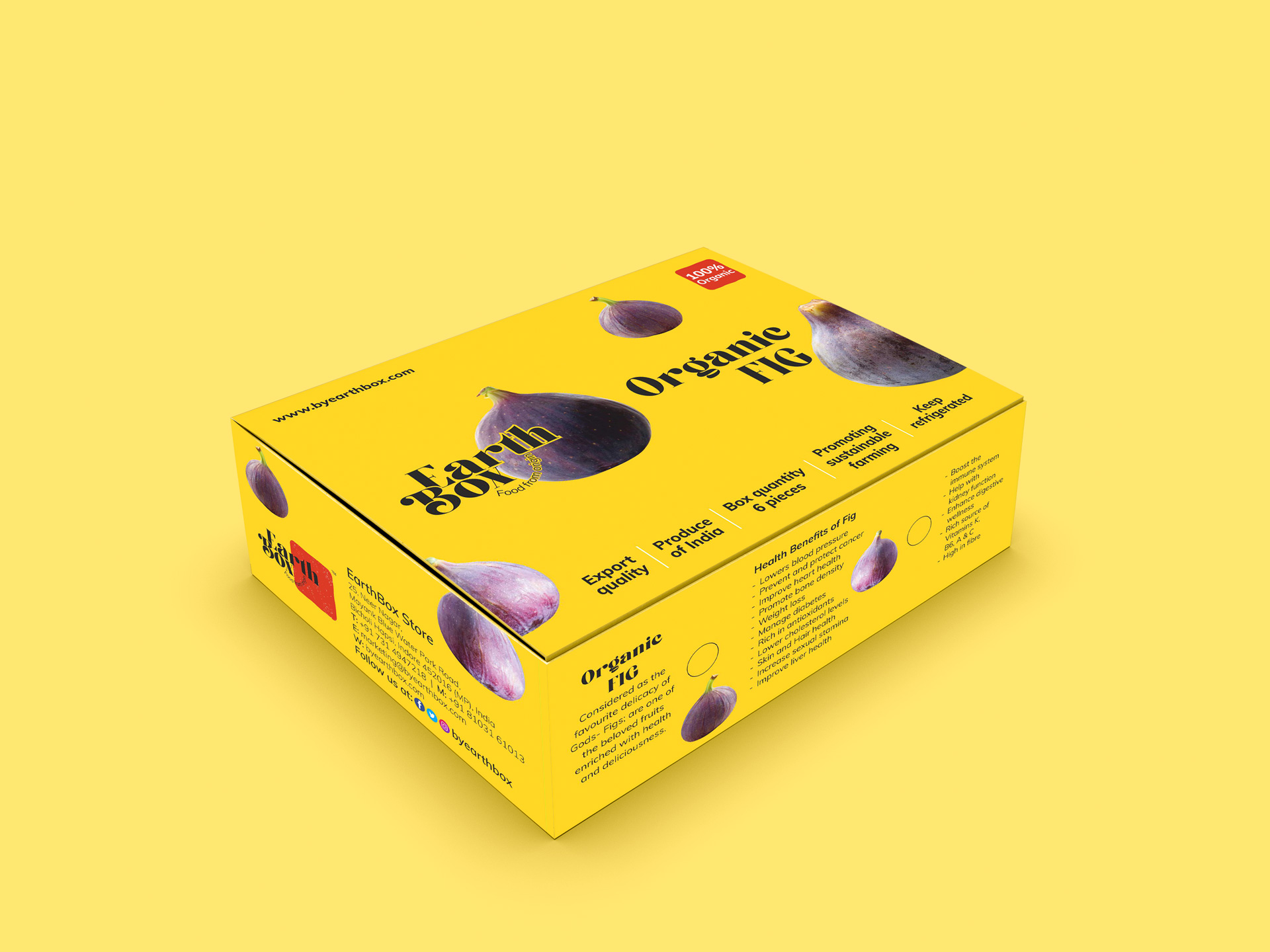
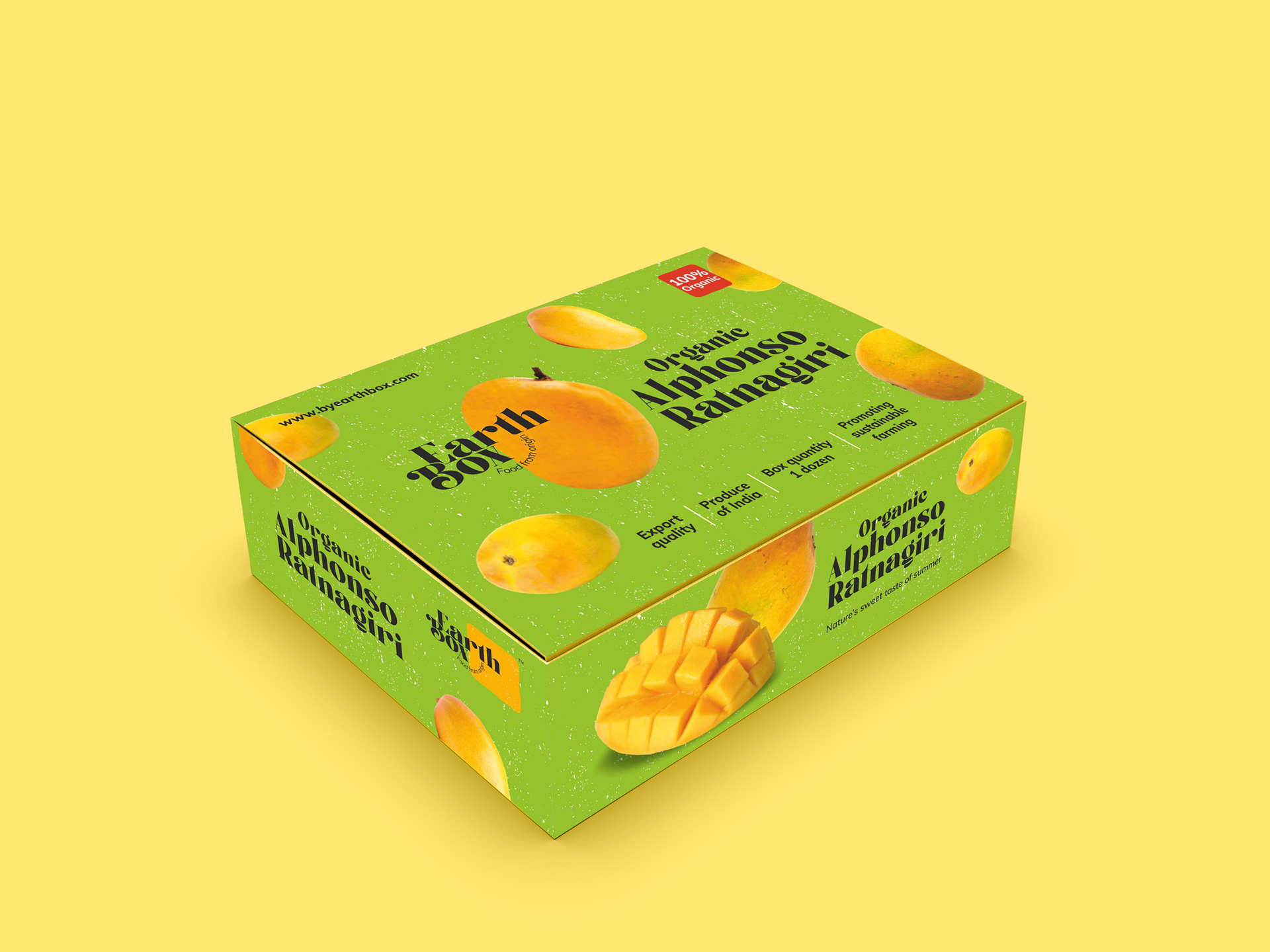
All the packaging from Earthbox are designed with the very ‘Earthy’ look and feel. Every packet is interactive – it tells a story and is designed to look fresh, engaging and stand out amongst the peers. The language of EarthBox packaging is created with images and colours to keep it earthy and fresh. To meet the exact needs of the client, we developed understanding of material, applications and provided effective solutions that helped in attaining the desired.
Packaging
EarthBox is one of a kind store in Indore, and to establish the similar offline brand image, we manifested all important elements to the physical store. The shelves in the store are designed to look likes boxes, with other earthy elements, while the wall colours match the brand palette. The posters designed for the space, highlight the benefits of particular products while co-promoting the maker and the brand.
